Spoilers? Are there any such thing as spoilers by the time Thursday hits? It certainly doesn't seem that way anymore, but let's be realistic here - this is the fifth issue since Dan Slott's Big Twist was revealed in Amazing Spider-Man #698 (followed up in #699 and #700, as well as Avenging Spider-Man #13.1, oh, and one issue of Daredevil if we want to count that). So if you're unaware of what's going on with Spider-Man (and how could you be by this point?) then consider yourself warned, because we're going to talk about this issue with specifics.
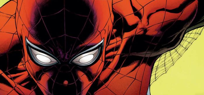
The Superior Spider-Man #1 finds Otto Octavius, Spider-Man's arch-nemesis Dr. Octopus, living in Peter Parker's body (with Parker dead in Octavius's buried body). While this isn't technically the first issue in an all-new direction, it is the first time we get to see Dr. Spiderpus take on some villains - in this case a new Sinister Six made up of also-rans from the old, lesser Sinister Syndicate (like Boomerang and Speed Demon). Slott has set up a conceit where Octavius was so inspired by Peter Parker's emotional triumphs, through their shared memories, that Octavius has decided to out-Spider-Man Spider-Man with "superior" intelligence and superhero techniques.
What started as an interesting new direction is already starting to wear out its welcome somewhat after five issues of non-Spidey Spider-Man comics. There's a difference between not being a villain and being a hero, and right now, Otto is simply existing as not-a-villain. He's still a colossally arrogant, alienating asshole who spends dinner with Mary Jane ignoring her conversation to leer at her breasts and treats Parker's co-workers at Horizon Labs with open contempt. Otto may have been a villain we loved to hate, but that kind of love doesn't mean we ever wanted to see him as the star of his own book, month after month.
It's time for writer Slott to introduce a foil, and we don't mean someone from Spidey's rogues. Right now, the book is all antagonist with no protagonist, despite the hero-versus-villians visuals of Spider-Man still fighting his baddies. The fix is a quick one - Superior needs someone good, someone the readers already like, to realize that Peter isn't Peter and start putting those pieces together, to Otto's chagrin. Create some real conflict. Slott may have long-term plans for Peter/Otto, but there's a void left by the general, genuine goodness of the original Spider-Man that isn't being filled by anyone in the current title.
And, frankly, Slott is making everyone in Peter's life look kind of stupid too. Peter/Otto's behavior is so abnormal, his dialogue so different, that I'm shocked that no one in the large supporting cast hasn't really started to suspect something. Instead, Slott has introduced conflict in the weirdest possible form, through Peter Parker's ghost maintaining physical control over Otto/Spidey's actions (in a ludicrous last-page reveal). What will that mean for future issues? Will ghostly Peter be the protagonist holding Otto/Spidey at bay? Is anyone really down for a year's worth of stories (or more) about the relationship between Peter Parker's ghost and his worst enemy parading as Spider-Man?
WILL I BE BACK FOR MORE? I've been on board this whole time until Superior Spider-Man #1 and now I'm iffy. Now that the potential of seeing Doc Ock as a would-be hero has become a reality, I'm not sure it's such a great idea. Sure, It's a great idea to drum up interest and get people talking, but I read Spider-Man, in part, because I simply like Spider-Man. Right now, I don't like Otto/Spidey, and I don't know how many more issues I can stomach the prick as the lead. I'd guess either a huge lesson in humility is on the way, or someone in the book is going to start putting clues together very soon. Maybe both things will happen. Then again, maybe neither will, and the new status quo will be a long-term Spider-Man book starring a dickhead and his ghostly conscience.